
I help researchers communicate their work through compelling words and images.
// Selected Work //

Kitselas Lands and Resources Department
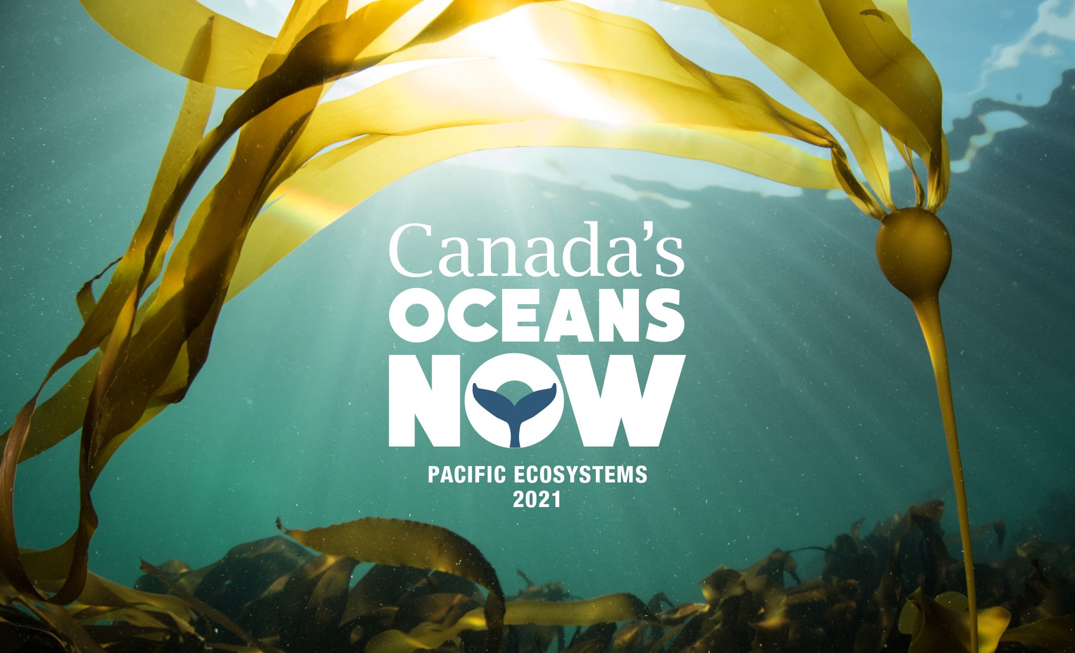
Fisheries and Oceans Canada 2021

Fisheries and Oceans Canada 2020

Fisheries and Oceans Canada 2019

Fisheries and Oceans Canada: Marine Protected Areas

First Nations Fisheries Council

David Suzuki Foundation

UBC Human Resources

Smaller infographic projects

Everything else
